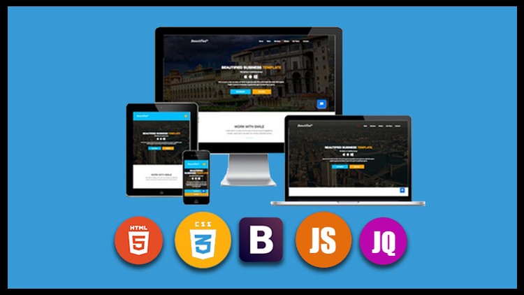
Build a new and modern looking Responsive websites

- Description
- Curriculum
- FAQ
- Reviews
Build a new and modern looking Responsive websites
Mobile first Web design to build a fully responsive website from scratch
Step by step learning of a real world project, creating a website. By the end of the course you will be able to expand your portfolio with different website designs. Learn to use HTML and CSS to build websites
Contents –
- Learn to build a website from scratch
- See the tools and resources used to create web code in action
- learn HTML and CSS and how they work together
- plan out your website and build it from scratch
- develop your website template using HTML and add styling to make it look good
- Source code is provided so you can use and tweak as needed to make your own version of this website.
Supports
I am here to help you learn web development and design. I’m ready to answer any questions you may have.
So what you thinking about
Nothing to lose, there is a 100% Money Back if you don’t like it
Want to know more, what are you waiting for take the first step. Join now to start learning to create websites today.
Who is the target audience?
- web designers
- web developers
- html and css coders
- anyone who wants to build a website
-
1
 Introductory
Hi This is the introductory video and here i have discussed that what i am covering with this entire course.So here the actual blueprint of this course is all about the website overview.
-
2
Basic file folder setups
HTML 5 || CSS 3 || BOOTSTRAP || JAVASCRIPT AND JQUERY || FULLY RESPONSIVE WEBSITE
Hi in this first class of the course i will be setting up all the files and folders for the website creation.We will create here four folders such as css,img,js and one folder for main files where all the folders will be put as a by name project.Then we will move ahead with the journey of website building.
-
3
Bootstrap linking with Html page
HTML 5 || CSS 3 || BOOTSTRAP || JAVASCRIPT AND JQUERY || FULLY RESPONSIVE WEBSITE
Hi there !
In this class i will link all the basics file like the frontend framework Bootstrap.For linking the Bootstrap file i will go at the website w3 school and there we will make a copy of max cdn of Bootstrap and after making a copy i will put that file just in the head section of index page to make it workable.For linking the Bootstrap file we have couple of ways such as you can use the official website like getbootstrap dot com and there you can download the full file folder going through the menus like get started but it will take more time to link exactly but if you use the best ways like go at the w3 schools and make a copy of cdn and put inside that.And also we have different ways to link the Bootstrap file like go at the website like html 5 boilerplate and download the file.Hope the ways of linking bootstrap file will help you.
-
4
Navigation markup and stylling
HTML 5 || CSS 3 || BOOTSTRAP || JAVASCRIPT AND JQUERY || FULLY RESPONSIVE WEBSITE
In this lecture i will create a simple markup for navigation by using a modern technologies like Html 5 and once it will be completed we will start styling it with the help of Bootstrap.So it will really help you to create a responsive navigation to the some extent,
-
5
Slider markup and styling part 1
HTML 5 || CSS 3 || BOOTSTRAP || JAVASCRIPT AND JQUERY || FULLY RESPONSIVE WEBSITE
In this lecture i will create a simple markup of slider and after creating a simple markup i will put some custom javascript and then some jQuery plugin like caroufredsel to make it enable.Once it will be linked or enabled beautifully then it will start sliding exactly as a slider.
-
6
slider markup and styling part 2
HTML 5 || CSS 3 || BOOTSTRAP || JAVASCRIPT AND JQUERY || FULLY RESPONSIVE WEBSITE
In this lecture i will put markup for the rest part of the slider like as for the button and also for the another elements which will come inside the slider section.So after getting everything exactly you can easily make your slider beautifully.
-
7
slider markup and styling part 3
HTML 5 || CSS 3 || BOOTSTRAP || JAVASCRIPT AND JQUERY || FULLY RESPONSIVE WEBSITE
in this video we will also fix the another issue of the slider like its breakpoint and also we will work for aligning all the elements at the center.So it will really lead you from the basics.
-
8
slider and carousel part 4
HTML 5 || CSS 3 || BOOTSTRAP || JAVASCRIPT AND JQUERY || FULLY RESPONSIVE WEBSITE
This is the another class for slider and in this class we will also work for the rest part of the slider to make it something like smooth sliding. you will really love it
-
9
Sticky navigation full class
HTML 5 || CSS 3 || BOOTSTRAP || JAVASCRIPT AND JQUERY || FULLY RESPONSIVE WEBSITE
In this class i will work for sticky navigation.So what is the sticky navigation in the website.Sticky navigation works like whenever the user will scroll the page down then user will get a addition of background color with the navigation and it will look so beautifully.For creating a sticky navigation we will work for custom javascript and also use some color in the css for the addition of background color in the background of navigation.it will rock you definitely.
-
10
Work section markup part 1
HTML 5 || CSS 3 || BOOTSTRAP || JAVASCRIPT AND JQUERY || FULLY RESPONSIVE WEBSITE
This will be the second section of this website for the work part and here we will create first the simple markup and once it will be completed full markup the we will move ahead for styling it.
-
11
work section styling part 2
In this lecture i will be styling the work section by using the stylesheet like css 3.So once it will be styled beautifully then it will look like so professionally and it will be also behave as a responsive.
-
12
work section part 3
In this lecture i will be styling the remaining work section by using the stylesheet like css 3.So once it will be styled beautifully then it will look like so professionally and it will be also behave as a responsive.
-
13
Work section styling final part 4
This lecture will be final lecture for the second section like work.So here we will take a look how responsive it is and how it is giving a transition effect on the each blocks.So it will be super professionally and awesome blocks.
-
14
Work feature markup part 1
In this lecture i will be creating a third section of this website.For creating it simply i will be putting some simple markup and then i will start styling the rest part as by using css 3 properties.So first the markup then the css 3 properties and also i will put here a background image with some cool opacity by using a specific code for the opacity.
-
15
Work feature markup and styling part 2
In this lecture i will be creating a third section of this website.For creating it simply i will be putting some simple markup and then i will start styling the rest part as by using css 3 properties.So first the markup then the css 3 properties and also i will put here a background image with some cool opacity by using a specific code for the opacity.
-
16
Work feature part 3
In this lecture i will be creating a third section of this website.For creating it simply i will be putting some simple markup and then i will start styling the rest part as by using css 3 properties.So first the markup then the css 3 properties and also i will put here a background image with some cool opacity by using a specific code for the opacity.
-
17
Final work feature part 4
In this lecture i will be creating a third section of this website.For creating it simply i will be putting some simple markup and then i will start styling the rest part as by using css 3 properties.So first the markup then the css 3 properties and also i will put here a background image with some cool opacity by using a specific code for the opacity.
-
18
More feature area markup part 1
HTML 5 || CSS 3 || BOOTSTRAP || JAVASCRIPT AND JQUERY || FULLY RESPONSIVE WEBSITE
in this lecture i will working for the more feature section here first i will put a simple markup and once it will be put exactly we will start styling for the section.And also we will make it as a responsive so it will open in all the devices respective bigger or smaller.
-
19
More feature area markup and styling part 2
HTML 5 || CSS 3 || BOOTSTRAP || JAVASCRIPT AND JQUERY || FULLY RESPONSIVE WEBSITE
Here i will be creating a simple markup and then we will put some specific properties of css 3 beautifully with the websites.And once all the markup and properties will be put nicely.Then we will go before the next section for the website.
-
20
More feature area part 3
HTML 5 || CSS 3 || BOOTSTRAP || JAVASCRIPT AND JQUERY || FULLY RESPONSIVE WEBSITE
Here i will be creating a simple markup and then we will put some specific properties of css 3 beautifully with the websites.And once all the markup and properties will be put nicely.Then we will go before the next section for the website.
-
21
More feature area final
Here i will be creating a simple markup and then we will put some specific properties of css 3 beautifully with the websites.And once all the markup and properties will be put nicely.Then we will go before the next section for the website.
-
22
Testimonials markup with slider part 1
HTML 5 || CSS 3 || BOOTSTRAP || JAVASCRIPT AND JQUERY || FULLY RESPONSIVE WEBSITE
In this video i will be working for simple markup of Html 5 and then we will move ahead for the styling.It will be super professionally and also it will be easier than all the previous section.
-
23
Testimonials markup with slider part 2
HTML 5 || CSS 3 || BOOTSTRAP || JAVASCRIPT AND JQUERY || FULLY RESPONSIVE WEBSITE
In this video we will discuss for the testimonials and also for its slider.For creating a slider in the testimonials we will put some pre-defined classes of Bootstrap and also some basics markup to make that working smoothly.
-
24
Testimonials with slider part 3
HTML 5 || CSS 3 || BOOTSTRAP || JAVASCRIPT AND JQUERY || FULLY RESPONSIVE WEBSITE
This is the final lecture over testimonials after completing this class from scratch students can easily create a fully responsive testimonials part with beautiful looking slider.So it will be interesting.
-
25
Our team markup and styling part 1
HTML 5 || CSS 3 || BOOTSTRAP || JAVASCRIPT AND JQUERY || FULLY RESPONSIVE WEBSITE
In this lecture we will work for our team section firstly i will create a basics markup and then we will put some styling by using css 3 advance properties and also we will work for some cool hover effect on blocks as a transition.So it will be interesting beautifully.
-
26
our team markup and styling part 2
HTML 5 || CSS 3 || BOOTSTRAP || JAVASCRIPT AND JQUERY || FULLY RESPONSIVE WEBSITE
In this lecture we will work for our team section firstly i will create a basics markup and then we will put some styling by using css 3 advance properties and also we will work for some cool hover effect on blocks as a transition.So it will be interesting beautifully.
-
27
our team styling part 3
HTML 5 || CSS 3 || BOOTSTRAP || JAVASCRIPT AND JQUERY || FULLY RESPONSIVE WEBSITE
In this lecture we will work for our team section firstly i will create a basics markup and then we will put some styling by using css 3 advance properties and also we will work for some cool hover effect on blocks as a transition.So it will be interesting beautifully.
-
28
our team part 4
HTML 5 || CSS 3 || BOOTSTRAP || JAVASCRIPT AND JQUERY || FULLY RESPONSIVE WEBSITE
In this lecture we will work for our team section firstly i will create a basics markup and then we will put some styling by using css 3 advance properties and also we will work for some cool hover effect on blocks as a transition.So it will be interesting beautifully.
-
29
our team final part as a responsive
HTML 5 || CSS 3 || BOOTSTRAP || JAVASCRIPT AND JQUERY || FULLY RESPONSIVE WEBSITE
In this lecture we will work for our team section firstly i will create a basics markup and then we will put some styling by using css 3 advance properties and also we will work for some cool hover effect on blocks as a transition.So it will be interesting beautifully.This is the last and final part for our team section and here we will also make it as responsive.
-
30
Download markup part 1
HTML 5 || CSS 3 || BOOTSTRAP || JAVASCRIPT AND JQUERY || FULLY RESPONSIVE WEBSITE
This is the easiest section for the download part.Here we will create a simple markup then i will put some styling for it and once everything will be put beautifully we will start doing some cool works for making it as a responsive.And at the end we will easily get the beautifully designed download section.
-
31
Download markup and styling part 2
HTML 5 || CSS 3 || BOOTSTRAP || JAVASCRIPT AND JQUERY || FULLY RESPONSIVE WEBSITE
This is the easiest section for the download part.Here we will create a simple markup then i will put some styling for it and once everything will be put beautifully we will start doing some cool works for making it as a responsive.And at the end we will easily get the beautifully designed download section.
-
32
Download section final
HTML 5 || CSS 3 || BOOTSTRAP || JAVASCRIPT AND JQUERY || FULLY RESPONSIVE WEBSITE
This is the easiest section for the download part.Here we will create a simple markup then i will put some styling for it and once everything will be put beautifully we will start doing some cool works for making it as a responsive.And at the end we will easily get the beautifully designed download section.
-
33
Contact me markup part 1
HTML 5 || CSS 3 || BOOTSTRAP || JAVASCRIPT AND JQUERY || FULLY RESPONSIVE WEBSITE
Here in this class i will crate fully aligned and responsive section as a contact me part.At the end we will get it as a responsive no doubt.
-
34
Contact me markup and styling part 2
HTML 5 || CSS 3 || BOOTSTRAP || JAVASCRIPT AND JQUERY || FULLY RESPONSIVE WEBSITE
Here in this class i will crate fully aligned and responsive section as a contact me part.At the end we will get it as a responsive no doubt.We will work for creating such a beautiful parts from scratch.
-
35
Contact me styling part 3
HTML 5 || CSS 3 || BOOTSTRAP || JAVASCRIPT AND JQUERY || FULLY RESPONSIVE WEBSITE
Here in this class i will crate fully aligned and responsive section as a contact me part.At the end we will get it as a responsive no doubt.We will work for creating such a beautiful parts from scratch.
-
36
Contact me section final part
HTML 5 || CSS 3 || BOOTSTRAP || JAVASCRIPT AND JQUERY || FULLY RESPONSIVE WEBSITE
Here in this class i will crate fully aligned and responsive section as a contact me part.At the end we will get it as a responsive no doubt.We will work for creating such a beautiful parts from scratch.
-
37
Google map and footer markup with understanding
HTML 5 || CSS 3 || BOOTSTRAP || JAVASCRIPT AND JQUERY || FULLY RESPONSIVE WEBSITE
Here in this lecture we will work for google map integrating with the website for integrating it we need a google api and once we put the google api keys for the map then it will start working smoothly with the website.So it is very easy to put the google map with websites.
-
38
Google map and footer part 2
HTML 5 || CSS 3 || BOOTSTRAP || JAVASCRIPT AND JQUERY || FULLY RESPONSIVE WEBSITE
Here in this lecture we will work for google map integrating with the website for integrating it we need a google api and once we put the google api keys for the map then it will start working smoothly with the website.So it is very easy to put the google map with websites.
-
39
Messanger enabling and menus linking with the sections
HTML 5 || CSS 3 || BOOTSTRAP || JAVASCRIPT AND JQUERY || FULLY RESPONSIVE WEBSITE
Here in this lecture we will work for google map integrating with the website for integrating it we need a google api and once we put the google api keys for the map then it will start working smoothly with the website.So it is very easy to put the google map with websites.
-
40
Smooth scrooling
HTML 5 || CSS 3 || BOOTSTRAP || JAVASCRIPT AND JQUERY || FULLY RESPONSIVE WEBSITE
Here in this lecture we will work for google map integrating with the website for integrating it we need a google api and once we put the google api keys for the map then it will start working smoothly with the website.So it is very easy to put the google map with websites.
-
41
Making navigation as a responsive
HTML 5 || CSS 3 || BOOTSTRAP || JAVASCRIPT AND JQUERY || FULLY RESPONSIVE WEBSITE
in this lecture we will make our navigation as responsive by using a plugin named slicknav.We will use to make our navigation as responsive and also we will put some custom css to define it beautifully.Once we put the custom css it will start working smoothly with the different types of screen sizes,
-
42
Responsive navigation part 2
HTML 5 || CSS 3 || BOOTSTRAP || JAVASCRIPT AND JQUERY || FULLY RESPONSIVE WEBSITE
in this lecture we will make our navigation as responsive by using a plugin named slicknav.We will use to make our navigation as responsive and also we will put some custom css to define it beautifully.Once we put the custom css it will start working smoothly with the different types of screen sizes,
-
43
Responsive works for all section
HTML 5 || CSS 3 || BOOTSTRAP || JAVASCRIPT AND JQUERY || FULLY RESPONSIVE WEBSITE
in this lecture we will make our navigation as responsive by using a plugin named slicknav.We will use to make our navigation as responsive and also we will put some custom css to define it beautifully.Once we put the custom css it will start working smoothly with the different types of screen sizes,
-
44
Last section for responsive
HTML 5 || CSS 3 || BOOTSTRAP || JAVASCRIPT AND JQUERY || FULLY RESPONSIVE WEBSITE
in this lecture we will make our navigation as responsive by using a plugin named slicknav.We will use to make our navigation as responsive and also we will put some custom css to define it beautifully.Once we put the custom css it will start working smoothly with the different types of screen sizes,