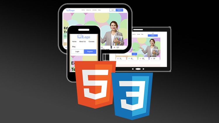
Make a Web Template Responsive Using HTML5 & CSS3
- Description
- Curriculum
- FAQ
- Reviews
Welcome to the “Make a Web Template Responsive Using HTML5 & CSS3” course
In this course, we plan to design a responsive educational website template together. If you want to know how this template is designed, take a look at my other course on this topic
In this course, we are going to make this template, which is designed only with HTML and CSS, and we have not used JavaScript in its design, in a responsive manner,.
To have a responsive web design in this course I will talk about:
-
Use media queries to specify different device sizes to define CSS rules
-
How to use developer tools in browsers for responsive design
-
Resize images and fonts for different screen sizes
-
How to hide items
-
Changing the arrangement of elements
In addition, we will face a number of challenges and problems (for example overlapping of elements) that we will examine and solve together in this course.
At the end of the course, we will talk about how to rebuild CSS, sort defined rules, as well as Object-Oriented CSS (OOCSS), and give tips on how to improve CSS rules.
If you are already familiar with HTML and CSS, but don’t know how to make a responsive template, I recommend watching this course.

External Links May Contain Affiliate Links read more


