Data Visualization with : BI ,SQL Server PostgreSQL, Excel

- Description
- Curriculum
- FAQ
- Reviews
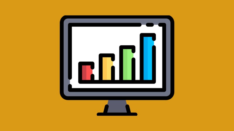
Data visualisation is the graphical representation of information and data.
By using visual elements like charts, graphs and maps, data visualisation tools provide an accessible way to see and understand trends, outliers and patterns in data. Every day businesses generates more data on sales revenue, marketing performance, customer interactions, inventory levels, production metrics, staffing levels, costs, and other KPIs. But with so much data to sift through, it can be difficult for people to see the story it tells.
Data visualization helps you turn all that granular data into easily understood, visually compelling—and useful—business information.
The benefits of data visualization
Hidden within your data lie important insights that can help drive business forward. But the challenge is that you can’t always connect the dots by looking at raw numbers alone. When you look at your data presented in a visual format, patterns, connections, insights emerge that would otherwise remain out of sight.
Data visualization brings data to life, making you the master storyteller of the insights hidden within your numbers. Through live dashboards, interactive reports, charts, graphs, and other visual representations, data visualization helps users develop powerful business insight quickly and effectively.
How to make the most of data visualization
Being able to see the story within the numbers makes data visualization a powerful tool for sharing and communicating information. Data visualization can be used for demonstrating performance, communicating trends, understanding the impact of new strategies, showing relationships, and beyond. These representations can be powerful tools for communication and collaboration, bringing greater value to reports, journalism, apps, or any context where sharing information is required.
While stunning, rich visuals can be great tools for communicating ideas, the end benefit of data visualization is its ability to drive better decision making.